Introduction
Earlier this year, AttendNC Counts introduced North Carolina’s Attendance Bright Spots, highlighting schools that had made unusually strong progress reducing chronic absenteeism since its pandemic-era peak. That first analysis offered a simple starting point by highlighting schools that had cut chronic absenteeism by 50% or more and inviting a practical next question: Which schools are reducing chronic absenteeism, and what can we learn from them?
This new analysis builds on that approach by taking a more context-sensitive look at bright spot schools. Rather than looking only at raw improvement, it surfaces schools outperforming model expectations given their structural and socioeconomic context. The result is a stronger way to identify schools that appear to be "beating the odds" and may be especially useful sites for learning. Using this approach, the analysis identified 310 bright spot schools across 62 counties and 75 public school units in North Carolina’s 2024–25 school year. Among traditional public schools, bright spots were distributed across 66 of North Carolina’s 115 school districts.
Use the dashboard to identify schools with similar contexts, compare improvement patterns, and select a small number of bright spots for deeper learning.
Open the Bright Spots Dashboard Share a Practice from Your School
How to Use This Map
Each point on the map represents a school identified through this context-adjusted bright spots analysis. The map is designed as a learning tool, not a scorecard. Its purpose is to help educators, district leaders, policymakers, and researchers identify places where something appears to be working, then learn more about what may be contributing to that success.
When you click a school, look for measures such as:
| Chronic Absenteeism Rates | Improvement Measures |
|---|---|
|
|
Together, these measures help users distinguish between schools that improved substantially and schools that are outperforming expectations after accounting for context.
Dig Deeper with the Dashboard
The dashboard includes two views: a Map view and a Table view. The map is useful for seeing where bright spot schools are located across the state, while the table allows users to review the same schools in a more detailed, sortable format. Users can also download the underlying data as a CSV file for local review or follow-up analysis.
The dashboard includes filters that allow users to narrow results by:
- County: limits results to schools located in a selected county.
- Bright spot category: filters schools by whether they are classified as Exceptional, Strong, or Promising bright spots.
- Decrease since the 2021–22 peak: narrows results based on how much a school’s chronic absenteeism rate has declined since its pandemic-era peak.
- Enrollment: limits results by school size.
- Grade band: filters schools by grade configuration, such as elementary, middle, high, or other school types.
- Poverty designation: narrows results by whether a school is identified as higher poverty.
- Share of economically disadvantaged students: filters schools based on the percentage of students identified as economically disadvantaged.
- School inclusion: allows users to view bright spots only or include all schools for broader comparison.
The Exceptional, Strong, and Promising categories indicate how strongly a school is outperforming model expectations. These filters are intended to help users focus the map and table, either on the clearest bright spots or on a broader group of schools showing encouraging results.
Learning from Bright Spots
Bright spots are most useful when they help educators identify a focused set of schools for deeper learning. The dashboard supports that process by helping users move from a broad statewide view to a more targeted comparison group.
Use the dashboard to identify schools like yours. Start with three practical questions:
- Who is improving in a context like ours?
Use the county, grade band, enrollment, poverty designation, and economically disadvantaged student filters to narrow the map and table to schools that are more comparable to your own. - Which schools are the clearest bright spots?
Use the Exceptional, Strong, and Promising categories to focus on schools that are outperforming model expectations by different degrees. - Where should we learn more?
Use the table to identify a small set of schools worth contacting, studying, or inviting into a peer-learning conversation.
Once you identify schools of interest, use these questions to guide a learning conversation:
- What systems changed in the school or district?
Consider attendance teams, early warning routines, outreach cadence, and how staff monitored progress. - Which barriers were reduced for students?
Consider transportation, health, scheduling, family supports, or other local challenges that may have affected attendance. - How did the school strengthen belonging and engagement?
Consider peer connections, adult mentorship, climate routines, student voice, or other relationship-centered practices. - What did leaders do to support implementation?
Consider staff roles, follow-through, communication routines, and how the work was sustained over time.
If you are a bright spot school and would like to help others learn from your work, use this link to share your success.
Interpreting Responsibly
This analysis is designed to support learning, not labeling. While the model accounts for structural factors, it cannot identify the specific practices, leadership decisions, or community conditions that drove improvement. School-level rates can also mask within-school variation, and some schools in the candidate pool warrant additional validation due to flags such as small denominators or non-standard school types.
| This analysis is... | This analysis is not... |
|---|---|
| A way to identify schools with meaningful attendance gains relative to context | A causal claim about why a school improved |
| A starting point for inquiry, site visits, and peer learning | A ranking of the “best” schools |
| A tool to help districts and schools ask what changed, what stayed consistent, and what adults did differently | Proof of a specific program or practice or that it will work everywhere |
Bright spot identification should be followed by local validation, including conversations with school staff, students, families, and district leaders.
About the Analysis
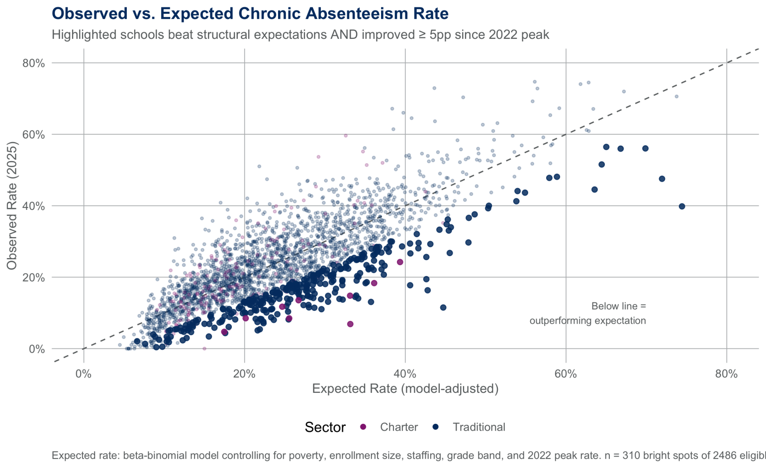
The original bright spots map was intentionally simple. It made improvement visible quickly and helped surface schools for further investigation. This new analysis shares that purpose, but strengthens the method. Instead of relying only on a statewide improvement threshold, this analysis uses a statistical model to estimate each school’s expected chronic absenteeism rate based on factors such as the share of economically disadvantaged students, school size, grade configuration, beginning teacher share, the school’s own 2021–22 absenteeism rate, and the district it belongs to.
To be identified as a bright spot in this analysis, a school had to meet two criteria:
- Better than expected: its observed absenteeism rate had to be meaningfully below what the model predicted for a school like it
- Genuine recovery: it also had to reduce chronic absenteeism by at least 5 percentage points from its 2021–22 peak
The chart below shows how those two criteria work together. Schools below the diagonal are outperforming model expectations and the highlighted schools are those that both exceeded model expectations and improved by at least 5 percentage points since their 2021–22 peak. These bright spot schools did not just improve in absolute terms, they also outperformed what the model predicted given their structural and socioeconomic context.
Why Context Matters
Chronic absenteeism is a multi-causal challenge, not a single student behavior problem. A strong attendance strategy has to account for barriers such as poverty, instability, transportation, staffing, grade span differences, and the uneven recovery that followed the pandemic. That is why this updated analysis matters. It shifts the conversation away from simple comparison and toward a fairer question: which schools are doing better than we would expect, given the realities they face?
This is also why the analysis is useful for continuous improvement. It does not claim to prove which program or strategy caused a school’s improvement. It helps narrow the field to schools worth studying more closely, especially schools serving students and communities that are too often overlooked when improvement is measured only in absolute terms.
Representation of Higher-Poverty Schools
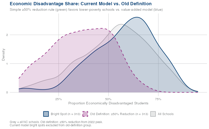
A school serving predominantly high-poverty students in a rural county faces different structural challenges than one serving a more affluent suburban community. The updated, context-adjusted bright spot model accounts for those differences by identifying schools that are outperforming expectations, not just those with the largest raw declines in chronic absenteeism.
The chart below shows why that matters. Under the older 50% reduction rule, bright spots were more concentrated among lower-poverty schools. The current model surfaces schools with a higher median share of economically disadvantaged students: 59%, compared with 47% under the prior rule.
It also identifies more high-poverty schools. Thirteen percent of current bright spots are schools where at least 75% of students are economically disadvantaged, compared with less than 1% under the old definition. This suggests the updated model is better positioned to recognize meaningful attendance improvement in higher-poverty schools and communities.
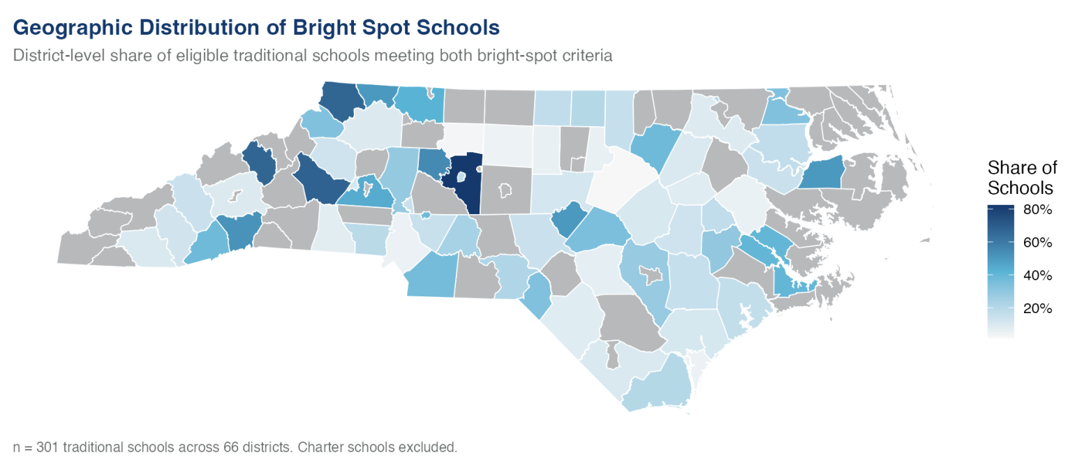
Geographic Spread and District-Level Concentration
Bright spots are distributed across North Carolina, from the mountains to the coast. No single region dominates, and no single district accounts for an outsize share of identified schools. That geographic spread matters because it suggests attendance recovery is not confined to the most affluent or best-resourced parts of the state.
As shown in the map below, identified bright spot schools span 62 of North Carolina’s 100 counties and include rural, suburban, and urban communities. Among traditional public schools, bright spots are distributed across 66 of North Carolina’s 115 school districts. The map shows some clustering in Davidson, Union, Burke, Catawba, and Henderson counties, but no single county or region dominates the list.
The district-level map below focuses on traditional public schools and shows the share of eligible schools in each district that met both bright-spot criteria. Darker shading indicates a higher share of eligible schools identified as bright spots. Districts in gray had no eligible traditional schools meeting both criteria.